)
Get the Most Out of your Glow in the Dark Stickers
Have you ever ordered glow in the dark stickers and felt like… is that it? No worries, I’ve got you.
There are a few smart tricks to keep in mind when designing glow in the dark stickers, and once you know them, the difference is huge. Let’s make sure your next batch actually glows the way you want it to!
TL;DR:
-
The entire material glows, your design controls how much glow is visible
-
Lighter colors glow stronger, dark inks block the effect
-
Bold shapes work better than tiny details
-
Use high-resolution artwork (300 DPI) for clean prints
-
Design in CMYK color mode
-
Charge stickers with light for the brightest glow
The Basics
Glow in the dark stickers are not magic. Well, not entirely at least. So there's a few thing to keep in mind before proceeding with your design.
Before uploading your design, there are a few technical things worth keeping in mind. They’re simple, but they can make a big difference in how your glow in the dark stickers turn out
Here’s what’s good to know:
-
Use high resolution (at least 300 DPI) so your design prints sharp and clean
-
Avoid extremely thin lines and tiny details.
-
Bold shapes and clear outlines work best on glow in the dark material
-
Design in CMYK color mode for accurate printing
)
Create the Suprise Moment
Your glow sticker has two personalities. One in daylight. One in the dark.
Don’t just design for how it looks when the lights are on. Think about the silhouette it creates when everything else disappears.
Simple shapes glow stronger. Bold icons read better. Clear outlines help your design stay recognizable in the dark.
Try this:
-
Make the glow areas slightly larger than you think you need
-
Use outlines to frame glowing elements
-
Avoid tiny glowing details that will blur together
)
Lights off. Glow on.
If your sticker isn’t glowing much, it probably just needs more light.
Glow in the dark stickers gain their power from light exposure, and they perform even better when exposed to UV light. The stronger and longer the light exposure, the brighter the glow.
Charge them up in daylight. Indoor lighting works too, but natural sunlight or UV light will give you the best results.
Then turn off the lights and watch your design come to life. Use them for indoor signs, ceiling stars or playful designs. The real moment happens when the lights go out.
Colors Make a Difference
One important thing to know: the entire sticker material is glow in the dark. This means that it's not possible to choose specific areas that glow. Instead, your design controls how much of that glow is visible.
The glow effect shines through the lighter parts of your design. The lighter the color, the more glow will show through. Dark inks block the glow, while lighter tones let it shine.
When setting up your file, make sure:
-
Your design is properly adapted for CMYK
-
You use lighter tones where you want maximum glow
-
You avoid covering glow areas with heavy dark ink
That said, contrast can look incredibly cool. A design that combines dark elements with bright glow areas creates a dramatic effect once the lights go out. Think black outlines around glowing shapes. Or a design that looks subtle in daylight but transforms in the dark.
)
Get your glow on
Glow in the dark stickers are not just about how they look in daylight. They’re about what happens after. Use lighter colors. Keep glow areas bold. Charge them properly. Design for the dark.
Ready to make something that shines when the lights go out?
Get Inspired. Get Creative.
Check out these glorious glowing stickers from some amazing artists.
)
)
)
)
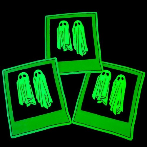
GITD design by @owlskulls
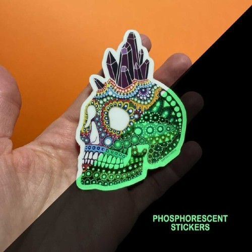
GITD design by @mpgautheron
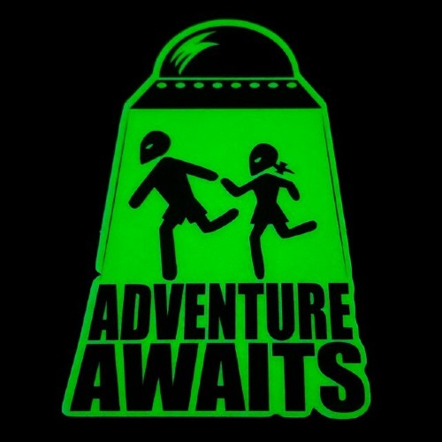
GITD design by @noshooe
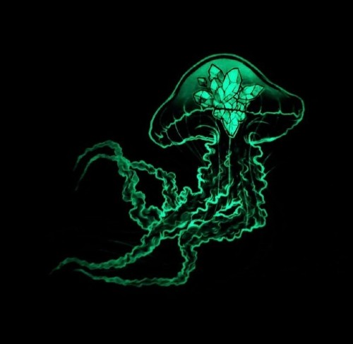
GITD design by @kerinewton
)
)
)
)
)
